from mytoolbox import solarAssignment #10
Unit 10
This week, we have two main objectives. First, we want to install our own development Python package. By setting up a local development package that contains useful math equations and functions, and running our computations and visualizations in a separate notebook, this assignment demonstrates how a larger project could be split into packaged code and analysis code. This will keep things organized and tidy, not only for yourself but also for future thesis supervisors and other collaborators.
Second, we continue working with our module solar to run some real-life calculations. Overall, these exercises will give you the opportunity to work on your skills in writing and applying own functions, creating and working with a DataFrame including datetime index, manipulating data, and plotting it using different plot types, such as creating quick working plots and polished figures.
Your own development package
With all the equations packed into our module and/or package, we can continue to answer and visualize some pretty cool questions. Start a new notebook and solve the remaining exercises there.
More exercises on the methods from previous Units
The remaining exercises below all use the DataFrame created in the previous exercise. It is the same DataFrame, solar_Dornbirn.csv, we already used in Assignment #08. So, if you are having challenges to solve exercise #10-02, just copy over the csv file from the other Unit.
#10-03: Idealized conditions in Dornbirn
Let’s look a bit deeper into the idealized clear-sky irradiance in Dornbirn over 2023.
- Create quick working plots like the following ones without spending time to style them etc. You just want to look at the data as conveniently and quickly as possible.
![]()
- Compute the maximum and median clear-sky irradiance for Dornbirn each day in 2023. Similarly to your working plots above, apply the Pandas
.plot()method (here,.plot.area()) to create a plot that you then style a little bit with legend, title, ylabel. Make it look as closely as possible to that one:
![]()
Note that the circles representing monthly means are a bit of a tricky part. Here are a few tips:
- First resample to monthly sampling (using sampling frequency
'MS') and compute the average. - You will then get a Series with the desired values at the index values ‘start of each month’.
- To display the circles at the mid of each month of the graph, add a time offset of 14 days to the index of your resampled monthly mean Pandas Series.
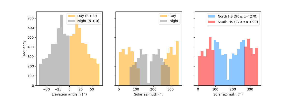
#10-04: Histograms
We stick with the same DataFrame, but want to look at the data in a different way.
- We start simple and create some very quick working plots. A histogram of the solar elevation angle and one of the solar azimuth.
- Now that you have your working plots, let’s modify them a bit. Create three panels next to each other that share the same y-axis. Try to emulate the following plot as closely as possible.
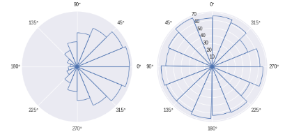
Working with angles would lend itself to plotting on a polar axis. There is nothing like a polar histogram readily available on matplotlib, but a quick Internet search highlights several solutions to modify the matplotlib barchart on a polar axis to your needs. An example with random data for your inspiration:
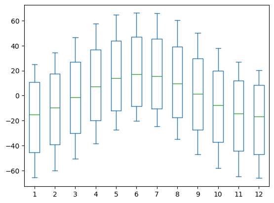
Exercise #10-05: Box plot with multiple artists
This exercise will help you to refine your skills in reshaping data frames to create working plots with multiple artists efficiently.
- Extract the month information from the datetime index and write it to a new column named “month”.
- Create a wide data frame with month as columns and elevation angle h as values using the .pivot() method.
- Try to reproduce the following figure
Solutions
Solution: Notebook
Assignment 10
#10-02: Applying our module solar
- We want to look at the entire year 2023 in Dornbirn. Create a Pandas DataFrame indexed by the datetime of the year in hourly sampling.
- Use the functions of our solar module to compute new columns of the DataFrame: the hourangle, the declination, the solar elevation angle, the solar azimuth, and also the clear-sky irradiance. Use the latitude and longitude of Dornbirn as defined by the variables
LAT_DOandLON_DOinsolar. - When computing the DataFrame, I get a runtime warning that there were invalid values encountered in a function call to
arccos. This means, we have to expect some missing values in our data set. Use the DataFrame methods.isna()and.sum()to check how many NaN’s our data set contains and which columns are affected.
import numpy as np
import pandas as pd
import matplotlib.pyplot as plt

from mytoolbox import solar
# Generate a datetime series for all of 2023 with hourly sampling
start_date = '2023-01-01'
end_date = '2023-12-31'
datetime = pd.date_range(start=start_date, end=end_date, freq='h')
DF = pd.DataFrame(index=datetime)DF| 2023-01-01 00:00:00 |
| 2023-01-01 01:00:00 |
| 2023-01-01 02:00:00 |
| 2023-01-01 03:00:00 |
| 2023-01-01 04:00:00 |
| ... |
| 2023-12-30 20:00:00 |
| 2023-12-30 21:00:00 |
| 2023-12-30 22:00:00 |
| 2023-12-30 23:00:00 |
| 2023-12-31 00:00:00 |
8737 rows × 0 columns
DF['tau'] = solar.comp_hourangle(DF.index)
DF['declination'] = solar.comp_declination(DF.index.day_of_year)
DF['h'] = solar.comp_elevangle(DF['tau'], DF['declination'], solar.LAT_DO)
DF['alpha'] = solar.comp_solarazimuth(DF['h'], DF['tau'], DF['declination'], solar.LAT_DO)
DF['iswr_clearsky'] = solar.parameterize_iswr_clearsky(DF['h'], DF.index.day_of_year, solar.LAT_DO, DF['declination'])DF.isna().sum()tau 0
declination 0
h 0
alpha 287
iswr_clearsky 0
dtype: int64#10-03: Idealized conditions in Dornbirn
Let’s look a bit deeper into the idealized clear-sky irradiance in Dornbirn over 2023.
- Create quick working plots like the following ones without spending time to style them etc. You just want to look at the data as conveniently and quickly as possible.
fig, (ax1, ax2) = plt.subplots(ncols = 2, figsize = (10, 5))
DF['iswr_clearsky'].plot(ax=ax1)
DF['iswr_clearsky'][0:49].plot(ax=ax2)
plt.savefig("iswr_clearsky_workingplots.png")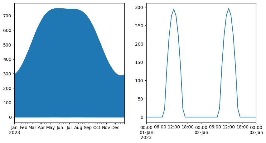
- Compute the maximum and median clear-sky irradiance for Dornbirn each day in 2023. Similarly to your working plots above, apply the Pandas
.plot()method (here,.plot.area()) to create a plot that you then style a little bit with legend, title, ylabel. Make it look as closely as possible to that one:
Note that the circles representing monthly means are a bit of a tricky part. Here are a few tips:
- First resample to monthly sampling (using sampling frequency
'MS') and compute the average. - You will then get a Series with the desired values at the index values ‘start of each month’.
- To display the circles at the mid of each month of the graph, add a time offset of 14 days to the index of your resampled monthly mean Pandas Series.
monthly_mean = DF['iswr_clearsky'].resample("MS").mean()
monthly_mean.index = monthly_mean.index + pd.to_timedelta(14, unit="D")

fig, ax = plt.subplots()
DF['iswr_clearsky'].resample("D").max().plot.area(ax=ax, color="green", alpha=0.3, label="Daily maximum")
DF['iswr_clearsky'].resample("D").median().plot.area(ax=ax, color="green", alpha=0.5, label="Daily median")
monthly_mean.plot(ax=ax, marker = "o", linestyle='none', color="yellow", label="Monthly mean")
ax.set_title("Idealized solar clear-sky irradiance in Dornbirn")
ax.set_ylabel("Irradiance (W/m2)")
ax.legend(loc="upper right")
plt.savefig("iswr_clearsky_styled.png")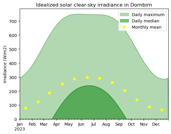
#10-04: Histograms
We stick with the same DataFrame, but want to look at the data in a different way.
- We start simple and create some very quick working plots. A histogram of the solar elevation angle and one of the solar azimuth.
DF['h'].plot.hist()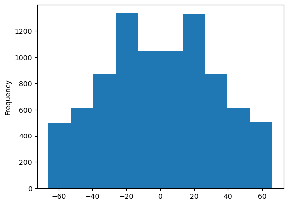
DF['alpha'].plot.hist()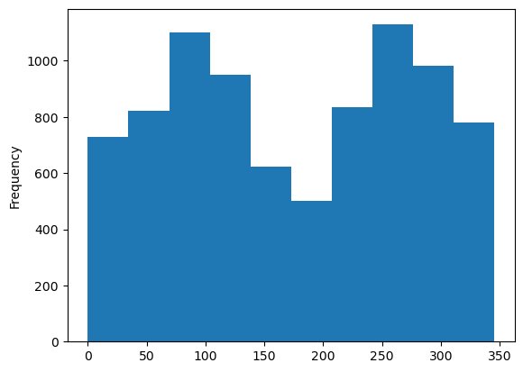
- Now that you have your working plots, let’s modify them a bit. Create three panels next to each other that share the same y-axis. Try to emulate the following plot as closely as possible.
# Figure and axes
fig, ax = plt.subplots(ncols=3, sharey=True, figsize=(12,4))

# First panel
DF.loc[DF['h'] > 0, 'h'].plot.hist(ax=ax[0], color="orange", alpha=0.5, label="Day (h > 0)")
DF.loc[DF['h'] < 0, 'h'].plot.hist(ax=ax[0], color="gray", alpha=0.5, label="Night (h < 0)")

# Second panel
DF.loc[DF['h'] > 0, 'alpha'].plot.hist(ax=ax[1], color="orange", alpha=0.5, label="Day", bins=20)
DF.loc[DF['h'] < 0, 'alpha'].plot.hist(ax=ax[1], color="gray", alpha=0.5, label="Night", bins=16)

# Third panel
DF.loc[(DF['alpha'] < 270) & (90 <= DF['alpha']), 'alpha'].plot.hist(ax=ax[2], color="dodgerblue", alpha=0.5, bins=12,
                                                                  label=r"North HS $(90 \leq \alpha < 270)$")
DF.loc[(270 <= DF['alpha']) | (DF['alpha'] < 90), 'alpha'].plot.hist(ax=ax[2], color="red", alpha=0.5, bins=22,
                                                                 label=r"South HS $(270 \leq \alpha < 90)$")

# Styling and labeling
ax[0].set_xlabel(r"Elevation angle h ($^\circ$)")
ax[0].legend()
ax[1].set_xlabel(r"Solar azimuth ($^\circ$)")
ax[1].legend()
ax[2].set_xlabel(r"Solar azimuth ($^\circ$)")
ax[2].legend()
plt.savefig("hist_elev_azimuth.png")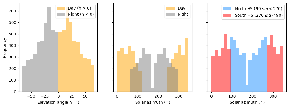
#10-05: Box plot with multiple artists
This exercise will help you to refine your skills in reshaping data frames to create working plots with multiple artists efficiently.
- Extract the month information from the datetime index and write it to a new column named “month”.
- Create a wide data frame with month as columns and elevation angle h as values using the .pivot() method.
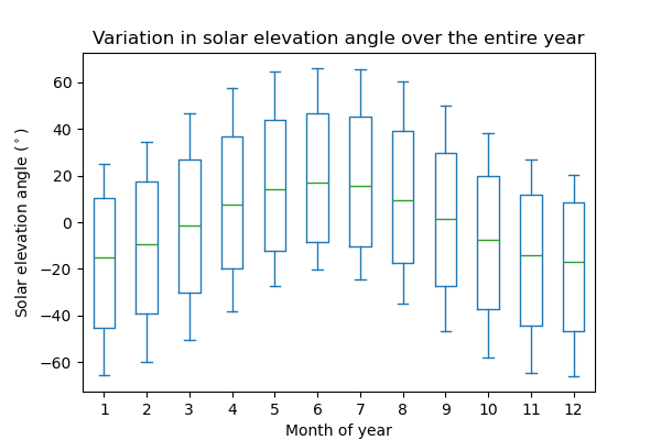
- Try to reproduce the following figure
DF['month'] = DF.index.month
DF_wide = DF.pivot(columns='month', values='h')
DF_wide.plot.box()

# The exact figure including the styles:
# fig, ax = plt.subplots(figsize=(6, 4))
# DF_wide.plot.box(ax=ax)
# ax.set_ylabel(r"Solar elevation angle ($^\circ$)")
# ax.set_xlabel("Month of year")
# ax.set_title("Variation in solar elevation angle over the entire year")
# plt.savefig("boxplot_series.png")