import numpy as np
import pandas as pd
import matplotlib.pyplot as pltAssignment #06
Unit 06
Until next week, work through the material provided in Unit 6 and solve the following exercises in a notebook.
Solution
Notebook
Download the notebook: 06_tasks_solved.ipynb
Assignment #06
#06-01: Use datetime provided in WX
- Load
WX_GNP.csv, the same data set we used in last unit’s assignment. - How many records are available from 2019?
- Create a new data frame
WX19that contains all records from the 2018/19 winter season. Let’s take all records between September and Mai. The only meteorological variables we need in addition to the meta variablesstation_idanddatetimearetaandiswr. - Save
WX19as a new csv file.
WX = pd.read_csv("../05_files/WX_GNP.csv", sep=",", parse_dates=["datetime"])
WX| datetime | station_id | hs | hn24 | hn72 | rain | iswr | ilwr | ta | rh | vw | dw | elev | |
|---|---|---|---|---|---|---|---|---|---|---|---|---|---|
| 0 | 2019-09-04 06:00:00 | VIR075905 | 0.000 | 0.000000 | 0.00000 | 0.000000 | 0.000 | 256.326 | 6.281980 | 94.7963 | 2.32314 | 241.468 | 2121 |
| 1 | 2019-09-04 17:00:00 | VIR075905 | 0.000 | 0.000000 | 0.00000 | 0.000196 | 555.803 | 288.803 | 12.524600 | 72.0814 | 4.38687 | 247.371 | 2121 |
| 2 | 2019-09-05 17:00:00 | VIR075905 | 0.000 | 0.000000 | 0.00000 | 0.000045 | 534.011 | 287.089 | 14.265400 | 55.1823 | 1.93691 | 239.254 | 2121 |
| 3 | 2019-09-06 17:00:00 | VIR075905 | 0.000 | 0.000000 | 0.00000 | 0.000026 | 546.008 | 292.024 | 14.136600 | 72.5560 | 3.67782 | 239.715 | 2121 |
| 4 | 2019-09-07 17:00:00 | VIR075905 | 0.000 | 0.000000 | 0.00000 | 0.000150 | 528.582 | 289.508 | 14.623800 | 68.9262 | 1.90232 | 227.356 | 2121 |
| ... | ... | ... | ... | ... | ... | ... | ... | ... | ... | ... | ... | ... | ... |
| 178733 | 2021-05-25 17:00:00 | VIR088016 | 279.822 | 2.197360 | 7.07140 | 0.108814 | 346.135 | 314.824 | 2.471430 | 94.4473 | 1.28551 | 170.356 | 2121 |
| 178734 | 2021-05-26 17:00:00 | VIR088016 | 272.909 | 0.000000 | 1.73176 | 0.001291 | 747.383 | 256.193 | 5.066340 | 78.2142 | 4.11593 | 208.909 | 2121 |
| 178735 | 2021-05-27 17:00:00 | VIR088016 | 267.290 | 2.412910 | 2.80912 | 0.167091 | 185.431 | 316.157 | 1.090880 | 97.3988 | 4.65204 | 218.963 | 2121 |
| 178736 | 2021-05-28 17:00:00 | VIR088016 | 275.573 | 11.509200 | 12.80780 | 0.000000 | 269.329 | 308.515 | 0.247583 | 88.5444 | 5.33803 | 263.788 | 2121 |
| 178737 | 2021-05-29 17:00:00 | VIR088016 | 267.562 | 0.259779 | 6.15200 | 0.000766 | 766.358 | 247.267 | 4.666620 | 69.3598 | 1.92538 | 256.041 | 2121 |
178738 rows × 13 columns
sum(WX['datetime'].dt.year == 2019)57120or less elegant, but conceptually simpler
WX[(WX['datetime'] >= pd.to_datetime('2019-01-01')) & (WX['datetime'] < pd.to_datetime('2020-01-01'))].shape[0]57120WX19 = WX.loc[
(WX['datetime'] >= pd.to_datetime('2018-09-01')) & (WX['datetime'] < pd.to_datetime('2019-06-01')),
['datetime', 'station_id', 'ta', 'iswr']
].copy()
print(f"There are {len(WX19['datetime'].unique())} unique time stamps between '{WX19['datetime'].min()}' and '{WX19['datetime'].max()}'.")There are 239 unique time stamps between '2018-09-05 06:00:00' and '2019-04-30 17:00:00'.or alternatively using datetime components:
WX19 = WX.loc[
    ((WX['datetime'].dt.year == 2018) & (WX['datetime'].dt.month >= 9)) |
    ((WX['datetime'].dt.year == 2019) & (WX['datetime'].dt.month <= 5)),
    ['datetime', 'station_id', 'ta', 'iswr']
].copy()
print(f"There are {len(WX19['datetime'].unique())} unique time stamps between '{WX19['datetime'].min()}' and '{WX19['datetime'].max()}'.")
There are 239 unique time stamps between '2018-09-05 06:00:00' and '2019-04-30 17:00:00'.WX19.to_csv("WX19.csv", index=False)#06-02: Quick ’n dirty time series
- From
WX19, create a new data frameWXzoom1that contains the records from the first two weeks of January and anystation_idof your choice. - Using the
WXzoom1data frame, plot a line graph of the temperature that also shows the measurements with circles and, in a different figure, plot an area curve of the incoming shortwave radiation.
WXzoom1 = WX19.loc[
    (WX19['datetime'].dt.dayofyear <= 14) & (WX19['station_id'].isin(["VIR075905"])),
    ['datetime', 'station_id', 'ta', 'iswr']
].copy()
WXzoom1| datetime | station_id | ta | iswr | |
|---|---|---|---|---|
| 57477 | 2019-01-01 17:00:00 | VIR075905 | -7.78452 | 111.1250 |
| 57478 | 2019-01-02 17:00:00 | VIR075905 | -7.09891 | 72.2500 |
| 57479 | 2019-01-03 17:00:00 | VIR075905 | -3.90653 | 27.7500 |
| 57480 | 2019-01-04 17:00:00 | VIR075905 | -4.25220 | 33.3125 |
| 57481 | 2019-01-05 17:00:00 | VIR075905 | -4.86277 | 100.0000 |
| 57482 | 2019-01-06 17:00:00 | VIR075905 | -8.70954 | 83.3750 |
| 57483 | 2019-01-07 17:00:00 | VIR075905 | -9.06894 | 44.4375 |
| 57484 | 2019-01-08 17:00:00 | VIR075905 | -11.57240 | 61.1250 |
| 57485 | 2019-01-09 17:00:00 | VIR075905 | -6.33497 | 61.1250 |
| 57486 | 2019-01-10 17:00:00 | VIR075905 | -3.93680 | 122.2500 |
| 57487 | 2019-01-11 17:00:00 | VIR075905 | -5.83427 | 133.3750 |
| 57488 | 2019-01-12 17:00:00 | VIR075905 | -5.70246 | 144.4380 |
| 57489 | 2019-01-13 17:00:00 | VIR075905 | -5.11887 | 144.4440 |
| 57490 | 2019-01-14 17:00:00 | VIR075905 | -6.42997 | 155.6250 |
WXzoom1.set_index('datetime', inplace=True)WXzoom1['ta'].plot(marker="o")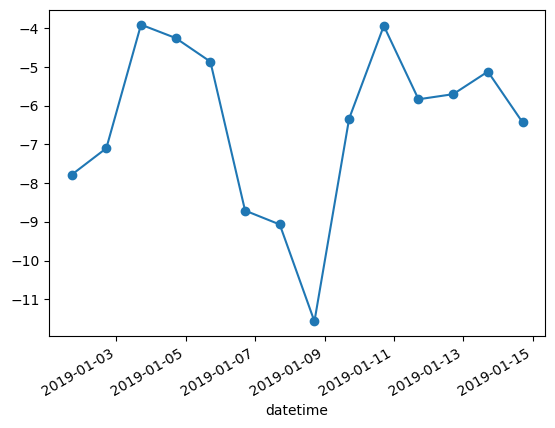
WXzoom1['iswr'].plot.area()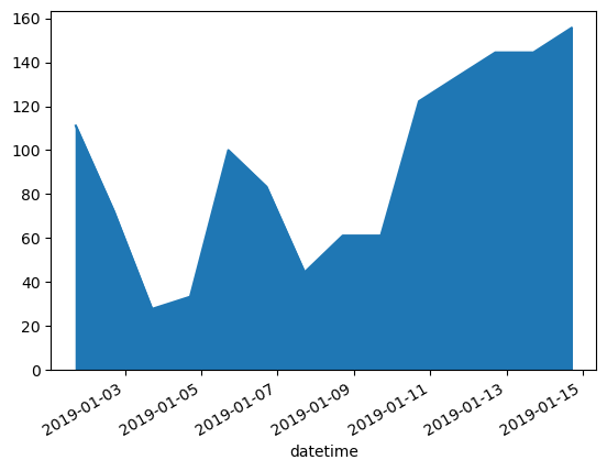
#06-03: Summary stats
- From
WX19, create a new data frameWXzoom2that contains the records from the first two weeks of January and the first twostation_id’s inWX19['station_id'].unique(). - Using the
WXzoom2data frame, what is the average temperature of each of the stations? - Using the
WXzoom2data frame, plot the temperature curves of both stations into one figure.
WXzoom2 = WX19.loc[
    (WX19['datetime'].dt.dayofyear <= 14) & (WX19['station_id'].isin(WX19["station_id"].unique()[:2])),
    ['datetime', 'station_id', 'ta', 'iswr']
].copy()
WXzoom2.set_index('datetime', inplace=True)WXzoom2.groupby("station_id")["ta"].mean()station_id
VIR075905 -6.472368
VIR075906 -5.492010
Name: ta, dtype: float64or alternatively, you can manually extract the values of all stations or use a loop:
for station in WXzoom2["station_id"].unique():
    print(f"{station}: {WXzoom2.loc[WXzoom2['station_id'] == station, 'ta'].mean():.4f}")
VIR075905: -6.4724
VIR075906: -5.4920fig, axs = plt.subplots()
WXzoom2["ta"][WXzoom2["station_id"] == WXzoom2["station_id"].unique()[0]].plot(ax=axs) # mind the `ax` argument to tell Pandas in where to plot this to
WXzoom2["ta"][WXzoom2["station_id"] == WXzoom2["station_id"].unique()[1]].plot(ax=axs)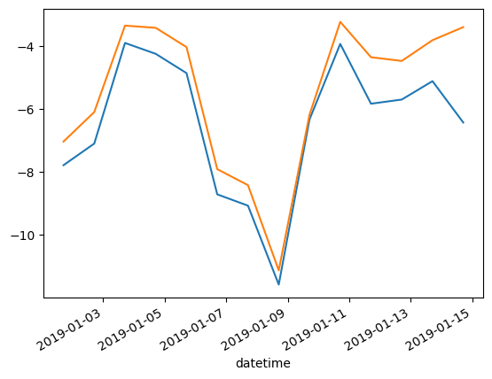
or alternatively, using a clever way of re-shaping the data frame from a long to a wide format, and making use of the fact that every column will become its own artist on the plot.
WXzoom2.pivot(columns="station_id", values="ta").plot()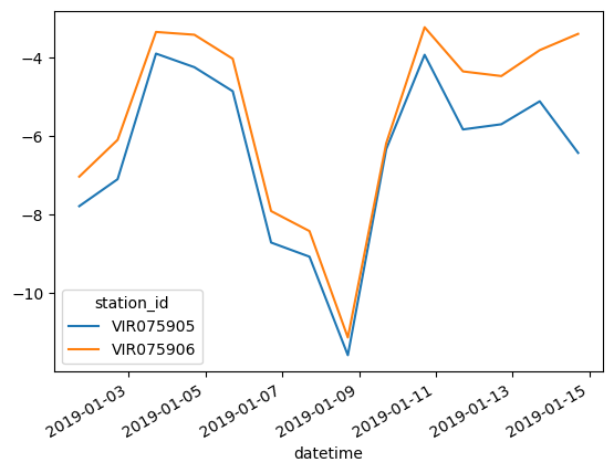
alternatively, you can achieve the same result with a loop. This will yield a much more inefficient computation, though, and also the plot will have to be adjusted (e.g., using ta_dt as x axis instead of ta_lower.index):