import numpy as np
import pandas as pd
import matplotlib.pyplot as plt
import matplotlib.dates as mdates
from datetime import datetime, timedeltaPandas & Matplotlib
Download this notebook: Pandas_Matplotlib.ipynb.
#Importing Titanic data
df_titanic = pd.read_csv("_files/titanic.csv")
df_titanic| PassengerId | Survived | Pclass | Name | Sex | Age | SibSp | Parch | Ticket | Fare | Cabin | Embarked | |
|---|---|---|---|---|---|---|---|---|---|---|---|---|
| 0 | 1 | 0 | 3 | Braund, Mr. Owen Harris | male | 22.0 | 1 | 0 | A/5 21171 | 7.2500 | NaN | S |
| 1 | 2 | 1 | 1 | Cumings, Mrs. John Bradley (Florence Briggs Th... | female | 38.0 | 1 | 0 | PC 17599 | 71.2833 | C85 | C |
| 2 | 3 | 1 | 3 | Heikkinen, Miss. Laina | female | 26.0 | 0 | 0 | STON/O2. 3101282 | 7.9250 | NaN | S |
| 3 | 4 | 1 | 1 | Futrelle, Mrs. Jacques Heath (Lily May Peel) | female | 35.0 | 1 | 0 | 113803 | 53.1000 | C123 | S |
| 4 | 5 | 0 | 3 | Allen, Mr. William Henry | male | 35.0 | 0 | 0 | 373450 | 8.0500 | NaN | S |
| ... | ... | ... | ... | ... | ... | ... | ... | ... | ... | ... | ... | ... |
| 886 | 887 | 0 | 2 | Montvila, Rev. Juozas | male | 27.0 | 0 | 0 | 211536 | 13.0000 | NaN | S |
| 887 | 888 | 1 | 1 | Graham, Miss. Margaret Edith | female | 19.0 | 0 | 0 | 112053 | 30.0000 | B42 | S |
| 888 | 889 | 0 | 3 | Johnston, Miss. Catherine Helen "Carrie" | female | NaN | 1 | 2 | W./C. 6607 | 23.4500 | NaN | S |
| 889 | 890 | 1 | 1 | Behr, Mr. Karl Howell | male | 26.0 | 0 | 0 | 111369 | 30.0000 | C148 | C |
| 890 | 891 | 0 | 3 | Dooley, Mr. Patrick | male | 32.0 | 0 | 0 | 370376 | 7.7500 | NaN | Q |
891 rows × 12 columns
Let us plot all the ages of the passengers using pandas .plot() function
#Plotting the "Age" column via .plot()
df_titanic["Age"].plot()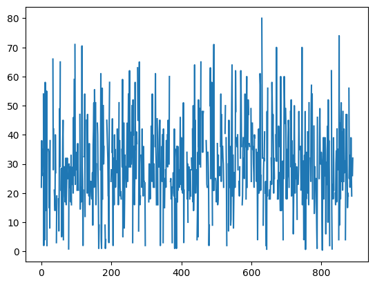
Hmmm… seems not really useful…
# Lets try sorting it?
df_titanic.sort_values(by=["Age"]).plot()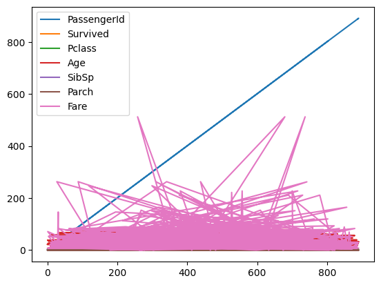
Also not the result we wanted…
Lets try sorting and saving it to a new dataframe? What does it contain?
df_titanic_new = df_titanic.sort_values(by=["Age"])
df_titanic_new.plot()
df_titanic_new| PassengerId | Survived | Pclass | Name | Sex | Age | SibSp | Parch | Ticket | Fare | Cabin | Embarked | |
|---|---|---|---|---|---|---|---|---|---|---|---|---|
| 803 | 804 | 1 | 3 | Thomas, Master. Assad Alexander | male | 0.42 | 0 | 1 | 2625 | 8.5167 | NaN | C |
| 755 | 756 | 1 | 2 | Hamalainen, Master. Viljo | male | 0.67 | 1 | 1 | 250649 | 14.5000 | NaN | S |
| 644 | 645 | 1 | 3 | Baclini, Miss. Eugenie | female | 0.75 | 2 | 1 | 2666 | 19.2583 | NaN | C |
| 469 | 470 | 1 | 3 | Baclini, Miss. Helene Barbara | female | 0.75 | 2 | 1 | 2666 | 19.2583 | NaN | C |
| 78 | 79 | 1 | 2 | Caldwell, Master. Alden Gates | male | 0.83 | 0 | 2 | 248738 | 29.0000 | NaN | S |
| ... | ... | ... | ... | ... | ... | ... | ... | ... | ... | ... | ... | ... |
| 859 | 860 | 0 | 3 | Razi, Mr. Raihed | male | NaN | 0 | 0 | 2629 | 7.2292 | NaN | C |
| 863 | 864 | 0 | 3 | Sage, Miss. Dorothy Edith "Dolly" | female | NaN | 8 | 2 | CA. 2343 | 69.5500 | NaN | S |
| 868 | 869 | 0 | 3 | van Melkebeke, Mr. Philemon | male | NaN | 0 | 0 | 345777 | 9.5000 | NaN | S |
| 878 | 879 | 0 | 3 | Laleff, Mr. Kristo | male | NaN | 0 | 0 | 349217 | 7.8958 | NaN | S |
| 888 | 889 | 0 | 3 | Johnston, Miss. Catherine Helen "Carrie" | female | NaN | 1 | 2 | W./C. 6607 | 23.4500 | NaN | S |
891 rows × 12 columns

The ages are now sorted as shown by the output, but the plot is still the same mess and full of unwanted data!
How about re-indexing everything?
df_titanic_new = df_titanic.sort_values(by=["Age"],ascending=True)
df_titanic_new = df_titanic_new.dropna() #Drop NaNs Try including/excluding the entries with NaN
df_titanic_new = df_titanic_new.reset_index(drop=True) #Resetting the index
df_titanic_new.plot() #Quick and dirty plot of the dataframe (nan ones dropped)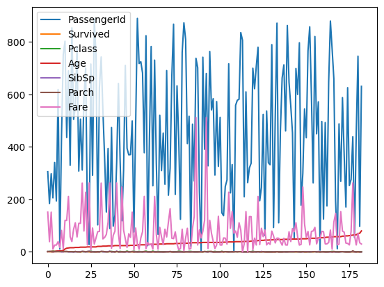
Ok, now we are getting there! How can we extract just the “Age” data out of the plot?
#Easy, just plot the now sorted "Age" column!
df_titanic_new["Age"].plot()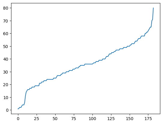
#You can also change the kind of plot you want to get
df_titanic_new["Age"].plot(kind="hist", xlabel="Age", ylabel="Amount of passenger")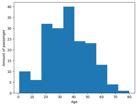
# Try to sort the fares (x-axis) over the age (y-axis)!
# Hint: .plot(x=..., y=..., kind="scatter")

#<Code goes here>

df_titanic_new = df_titanic.loc[:, ["Age", "Fare"]]
df_titanic_new = df_titanic_new.dropna()  # Remove rows with missing values
df_titanic_new = df_titanic_new.sort_values(by=["Fare", "Age"])  # Sort by Fare, then Age

df_titanic_new.plot(x="Fare", y="Age", kind="scatter", title="Age vs. Fare")
df_titanic_new| Age | Fare | |
|---|---|---|
| 302 | 19.0 | 0.0000 |
| 271 | 25.0 | 0.0000 |
| 179 | 36.0 | 0.0000 |
| 822 | 38.0 | 0.0000 |
| 806 | 39.0 | 0.0000 |
| ... | ... | ... |
| 341 | 24.0 | 263.0000 |
| 438 | 64.0 | 263.0000 |
| 258 | 35.0 | 512.3292 |
| 737 | 35.0 | 512.3292 |
| 679 | 36.0 | 512.3292 |
714 rows × 2 columns

Pandas plots are great for simple and quick visualization of data, but not very flexible for using multiple and/or complex plots!
# Look at that for example:
#Changing parameters of colors, legends, etc. for each plot will give you a hard time this way!
df_titanic[["Age", "Fare", "Pclass"]].dropna().plot(subplots=True, layout=(2, 2), figsize=(10, 8))
array([[<Axes: >, <Axes: >],
[<Axes: >, <Axes: >]], dtype=object)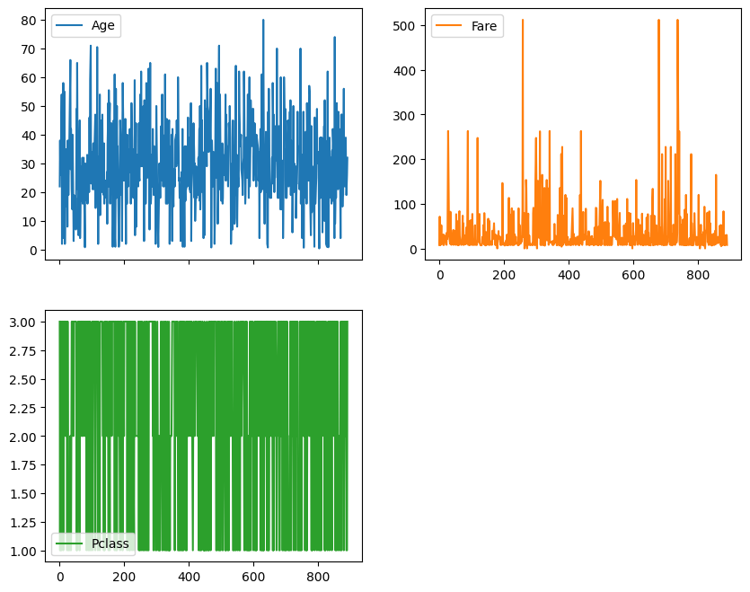
There is another way to create highly customizable plots in Python!
#As for example:

import matplotlib.pyplot as plt

# Sample customized plot using Matplotlib
plt.figure(figsize=(10, 6))  # Set figure size
plt.scatter(df_titanic_new["Fare"], df_titanic_new["Age"], color='b', alpha=0.5)
plt.title("Age vs. Fare - What a nice plot!")
plt.xlabel("Fare")
plt.ylabel("Age")
plt.grid(True)
plt.show()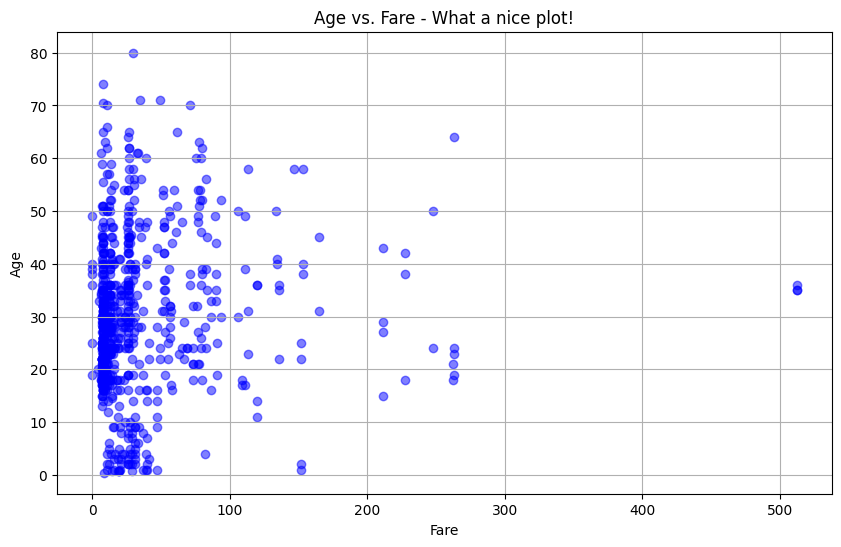
But we shall not get ahead of ourselfs. Slow and steady…
What are Figures und Axis?
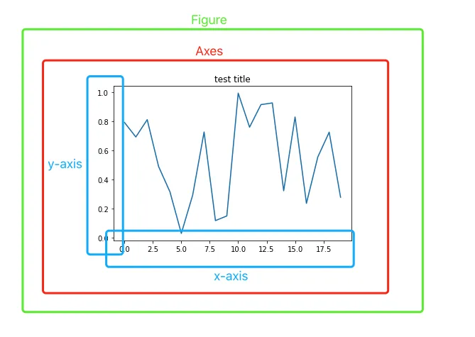
The very basics of every plot are shown above!
- A “Figure” is like a piece of paper. Everything needs to be printed on something. You also can print multiple plots in one figure.
- On the next layer are “Axes”. Each Axes object is an individual plot or “subplot” within the Figure and contain specific data such as scaling informations.
- Other elements of the plot(s) like legends, titles, etc. are part of the Axes object and are either inside the plot area (such as data points and gridlines) or just outside it (like axis labels, titles, and legends).
fig, ax = plt.subplots()   #Creating a figure and axes object using matplots subplot function. Yes, even for just a sigle plot!
ax.plot(np.random.rand(20)) #Generate some random numbers
ax.set_title('test title') #Set a title
plt.show()  #And show the plot!

print(type(fig)) #Print the type of the "fig" variable
print(type(ax))  #Print the type of the "ax" variable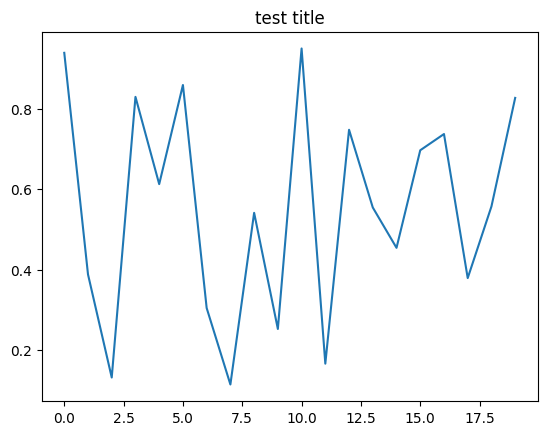
<class 'matplotlib.figure.Figure'>
<class 'matplotlib.axes._axes.Axes'>
# Using the subplot method specifically
row = 2
column = 2
fig, axes = plt.subplots(row, column)
for a in range(row):
for b in range(column):
ax = axes[a][b]
ax.plot(np.random.rand(20))
ax.set_title(f"Plot: ({a, b})")
fig.suptitle("Hier könnte Ihr Titel stehen!")
fig.tight_layout() # Nice method for making your plots a bit prettier. (Adjusts spacing automatically)
plt.show()
print(type(fig))
print(type(ax))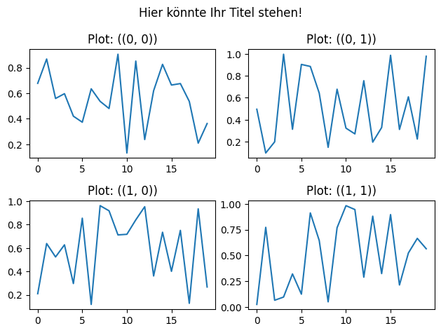
<class 'matplotlib.figure.Figure'>
<class 'matplotlib.axes._axes.Axes'>
#Code I used to create the data for the following "EnergyUsage.csv"
"""
import pandas as pd
import numpy as np
import datetime
import matplotlib.pyplot as plt
# Datumbereich erstellen (3 Monate, stündlich)
start_date = datetime.datetime(2024, 1, 1)
end_date = start_date + datetime.timedelta(days=90)
date_range = pd.date_range(start=start_date, end=end_date, freq='H')
# Zufällige Werte für Energieverbrauch und Spannung erzeugen
np.random.seed(42) # Für die Reproduzierbarkeit der Zufallszahlen
energy_consumption = np.random.uniform(low=5, high=50, size=len(date_range)) # Mittelwert: 50, Standardabweichung: 10
voltage = np.random.normal(loc=230, scale=5, size=len(date_range)) # Mittelwert: 230V, Standardabweichung: 5
grid_frequency = np.random.normal(loc=50, scale=0.1, size=len(date_range)) # Netzfrequenz um 50 Hz mit etwas Schwankung
# DataFrame erstellen
data = {
'EnergyConsumption': energy_consumption,
'Voltage': voltage,
'GridFrequency': grid_frequency
}
df = pd.DataFrame(data, index=date_range)
df.index.set_names("DateTime", inplace=True)
# Simulierter Stromausfall durch z.B. ein kaputtes Kabel bei Bauarbeiten
start_outage = datetime.datetime(2024, 2, 1, 12, 0, 0) # Annahme: Ein fiktives Startdatum und eine Uhrzeit für den Stromausfall
duration = pd.Timedelta(hours=23) # Dauer des Stromausfalls
# Markiere den Zeitraum des Stromausfalls im DataFrame
df.loc[start_outage:start_outage+duration] = 0
df.to_csv("EnergyUsage.csv")
df
"""'\nimport pandas as pd\nimport numpy as np\nimport datetime\nimport matplotlib.pyplot as plt\n\n# Datumbereich erstellen (3 Monate, stündlich)\nstart_date = datetime.datetime(2024, 1, 1)\nend_date = start_date + datetime.timedelta(days=90)\ndate_range = pd.date_range(start=start_date, end=end_date, freq=\'H\')\n\n# Zufällige Werte für Energieverbrauch und Spannung erzeugen\nnp.random.seed(42) # Für die Reproduzierbarkeit der Zufallszahlen\nenergy_consumption = np.random.uniform(low=5, high=50, size=len(date_range)) # Mittelwert: 50, Standardabweichung: 10\nvoltage = np.random.normal(loc=230, scale=5, size=len(date_range)) # Mittelwert: 230V, Standardabweichung: 5\ngrid_frequency = np.random.normal(loc=50, scale=0.1, size=len(date_range)) # Netzfrequenz um 50 Hz mit etwas Schwankung\n\n# DataFrame erstellen\ndata = {\n \'EnergyConsumption\': energy_consumption,\n \'Voltage\': voltage,\n \'GridFrequency\': grid_frequency\n}\n\ndf = pd.DataFrame(data, index=date_range)\ndf.index.set_names("DateTime", inplace=True)\n\n# Simulierter Stromausfall durch z.B. ein kaputtes Kabel bei Bauarbeiten\nstart_outage = datetime.datetime(2024, 2, 1, 12, 0, 0) # Annahme: Ein fiktives Startdatum und eine Uhrzeit für den Stromausfall\nduration = pd.Timedelta(hours=23) # Dauer des Stromausfalls\n\n# Markiere den Zeitraum des Stromausfalls im DataFrame\ndf.loc[start_outage:start_outage+duration] = 0\n\ndf.to_csv("EnergyUsage.csv")\ndf\n'Either run the code to generate EnergyUsage.cvs yourself, or download it here: EnergyUsage.csv.
#First steps in creating plots using matplot

df = pd.read_csv("_files/EnergyUsage.csv", index_col="DateTime")
print(type(df.index))   #Currently our index is just a "simpe index". Use the argument "parse_dates=True" to skip the next step.
<class 'pandas.core.indexes.base.Index'>df.index = pd.to_datetime(df.index) #Parse the index from "base" to "datetime"
print(type(df.index))
fig, ax = plt.subplots(figsize=(12,6))
df["EnergyConsumption"].plot(color="red", ax=ax, label='Power Usage')
df["GridFrequency"].plot(color="blue", ax=ax, label='Grid Frequency')
df["Voltage"].plot(color="green", ax=ax, label='Grid Voltage')
plt.title('Energy Consumption Jan - Mar')
plt.xlabel('Datetime')
plt.ylabel('Power Usage, Frequency, Voltage')
plt.legend()
plt.grid(True)
plt.xticks(rotation=45)
plt.tight_layout()
plt.show()<class 'pandas.core.indexes.datetimes.DatetimeIndex'>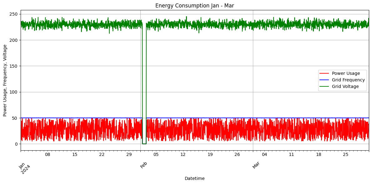
df.index = pd.to_datetime(df.index) #Parse the index from "base" to "datetime"
print(type(df.index))
fig, [ax1, ax2, ax3] = plt.subplots(1,3,figsize=(12,6))

# Plot the Energy Consumption on ax1 (left subplot)
df["EnergyConsumption"].plot(color="red", ax=ax1, label='Power Usage')
ax1.set_title('Energy Consumption')
ax1.set_xlabel('Datetime')
ax1.set_ylabel('Power Usage')
ax1.legend()
ax1.grid(True)

# Plot the Grid Frequency on ax2 (middle subplot)
df["GridFrequency"].plot(color="blue", ax=ax2, label='Grid Frequency')
ax2.set_title('Grid Frequency')
ax2.set_xlabel('Datetime')
ax2.set_ylabel('Frequency')
ax2.legend()
ax2.grid(True)

# Plot the Voltage on ax3 (right subplot)
df["Voltage"].plot(color="green", ax=ax3, label='Grid Voltage')
ax3.set_title('Grid Voltage')
ax3.set_xlabel('Datetime')
ax3.set_ylabel('Voltage')
ax3.legend()
ax3.grid(True)
<class 'pandas.core.indexes.datetimes.DatetimeIndex'>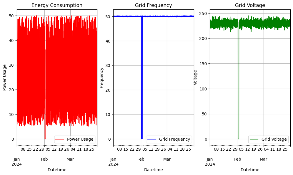
Tinkering with some cosmetics
df.index = pd.to_datetime(df.index)

fig, ax = plt.subplots(figsize=(14, 8))
df["EnergyConsumption"].plot(color="red", ax=ax, label='Power Usage')
df["GridFrequency"].plot(color="blue", ax=ax, label='Grid Frequency', linestyle="-.")
df["Voltage"].plot(color="green", ax=ax, label='Grid Voltage')

plt.title('Energy Consumption Jan - Mar', fontsize=20, color="Orange")
plt.xlabel('Datetime', fontsize=18)
plt.ylabel('Power Usage, Frequency, Voltage', fontsize=18)
plt.legend(fontsize=12)
plt.xticks(rotation=90)

# Hier werden die Anpassungen für die X-Achse vorgenommen
ax.xaxis.set_major_locator(mdates.DayLocator(interval=20))  # Tägliche Intervalle
ax.xaxis.set_major_formatter(mdates.DateFormatter('%m-%d'))  # Datumsformat

plt.yticks(range(0,260,20))
plt.grid(True)
plt.tight_layout()
plt.show()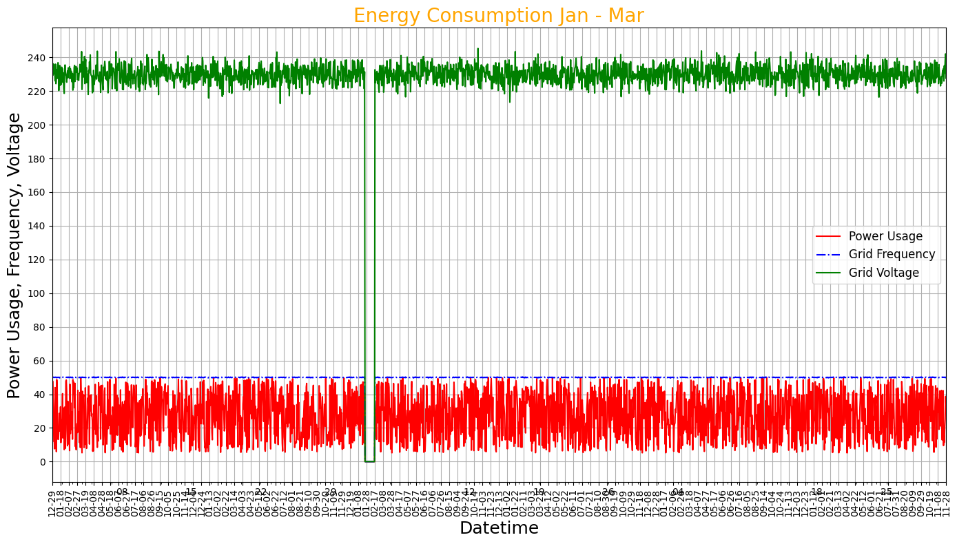
#Change the tick intervals on the bottom

df.index = pd.to_datetime(df.index)

fig, ax = plt.subplots(figsize=(14, 8))
df["EnergyConsumption"].plot(color="red", ax=ax, label='Power Usage')
df["GridFrequency"].plot(color="blue", ax=ax, label='Grid Frequency', linestyle="-.")
df["Voltage"].plot(color="green", ax=ax, label='Grid Voltage')

plt.title('Energy Consumption Jan - Mar', fontsize=20, color="Orange")
plt.xlabel('Datetime', fontsize=18)
plt.ylabel('Power Usage, Frequency, Voltage', fontsize=18)
plt.legend(fontsize=12)
plt.xticks(rotation=90)

# Hier werden die Anpassungen für die X-Achse vorgenommen
ax.xaxis.set_major_locator(mdates.DayLocator(interval=28))  # Tägliche Intervalle
ax.xaxis.set_major_formatter(mdates.DateFormatter('%m-%d'))  # Datumsformat

plt.yticks(range(0,260,20))
plt.grid(True)
plt.tight_layout()
plt.show()
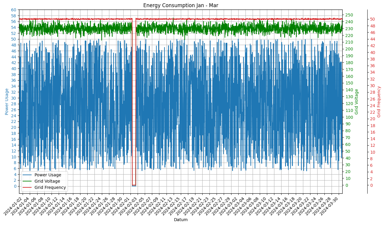
#Creating mutliple Y-Axis and "cleaning" the X-Axis

df.index = pd.to_datetime(df.index)

fig, ax1 = plt.subplots(figsize=(14, 8))

#First Y-Axis
color2 = 'tab:blue'
ax1.set_xlabel("Datum")
ax1.set_ylabel("Power Usage", color=color2)
ax1.plot(df.index, df["EnergyConsumption"], color=color2, label="Power Usage")
ax1.tick_params(axis='y', labelcolor=color2)
ax1.set_yticks(range(0,62,2))
ax1.grid()
ax1.set_xticklabels([date.strftime('%Y-%m-%d') for date in df.index], rotation=45, ha='right')

ax1.xaxis.set_major_locator(mdates.DayLocator(interval=2)) # Jeder zweite Tag wird auf den x-Ticks dargestellt
ax1.xaxis.set_major_formatter(mdates.DateFormatter('%Y-%m-%d'))

#Second Y-Axis
ax2 = ax1.twinx()
color3 = "green"
ax2.set_ylabel("Grid Voltage", color=color3)
ax2.plot(df.index, df["Voltage"], color=color3, label="Grid Voltage")
ax2.tick_params(axis='y', labelcolor=color3)
ax2.set_yticks(range(0,260, 10))

#Third Y-Axis
color1 = 'tab:red' # Verwendung von tab:red anstelle von red ist eine spezielle Konvention in Matplotlib für die Verwendung von "Tableau Colors".
ax3 = ax1.twinx()
ax3.set_ylabel("Grid Frequency", color=color1)
ax3.plot(df.index, df["GridFrequency"], color=color1, label="Grid Frequency")
ax3.tick_params(axis='y', labelcolor=color1)
ax3.set_yticks(range(0,52,2))
ax3.spines["right"].set_position(("outward", 60))

# Combine the Linelabels
lines, labels   = ax1.get_legend_handles_labels()
lines2, labels2 = ax2.get_legend_handles_labels()
lines3, labels3 = ax3.get_legend_handles_labels()
lines += lines2 + lines3
labels += labels2 + labels3

#Command for the positioning of the legend: loc="POSITION"
#Usable commands are: Best, upper/lower left/right, right, center left/right, lower/upper center and center
plt.legend(lines, labels, loc="best")
plt.xlim((df.index[0], df.index[len(df)-1]))
plt.title("Energy Consumption Jan - Mar")
plt.show()
C:\Users\nicom\AppData\Local\Temp\ipykernel_5468\4157523258.py:15: UserWarning: set_ticklabels() should only be used with a fixed number of ticks, i.e. after set_ticks() or using a FixedLocator.
ax1.set_xticklabels([date.strftime('%Y-%m-%d') for date in df.index], rotation=45, ha='right')